As the creator of "Travels Unfiltered," my goal was to establish a brand that truly reflects the spirit of worldwide travel. Initially, I gathered an array of travel-themed imagery, including globes, maps, and travel documents. This collection laid the groundwork for my initial sketches and the development of our brand's visual identity.
Logo Design and Adaptability: The centrepiece of our visual identity is the logo, featuring a world globe with a pin marker. This design symbolises the global scope of our content. I crafted the logo, ensuring it was versatile for various applications. The logo incorporates earthy tones of blue and green, with a standout pink pin for a pop of colour. I also created different logo versions, including a text-free variant and a 'TU' version, to maintain brand recognition across diverse formats.
Colour Palette and Branding: Our brand's colour scheme revolves around earthy tones, mirroring the diverse landscapes of our planet. This palette is consistently used in all our marketing materials, balancing the need for aesthetic appeal with the functionality of text readability.
Font Choice and Modern Aesthetics: In all our content, we utilise a sans-serif font. This choice not only enhances readability but also lends a contemporary feel to our branding.
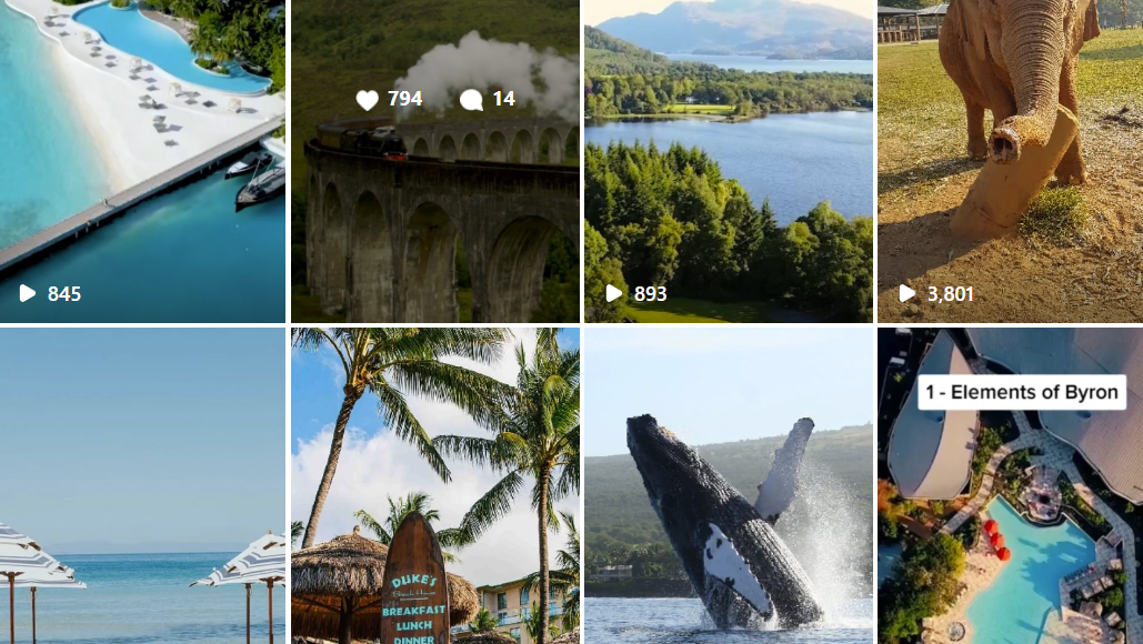
Social Media Strategy and Revamp: Social media is integral to "Travels Unfiltered." We focus on creating graphics that are visually appealing and informative. Our recent revamp of Instagram and YouTube was aimed at improving these aspects, enhancing both the aesthetic value and the informational content of our posts.
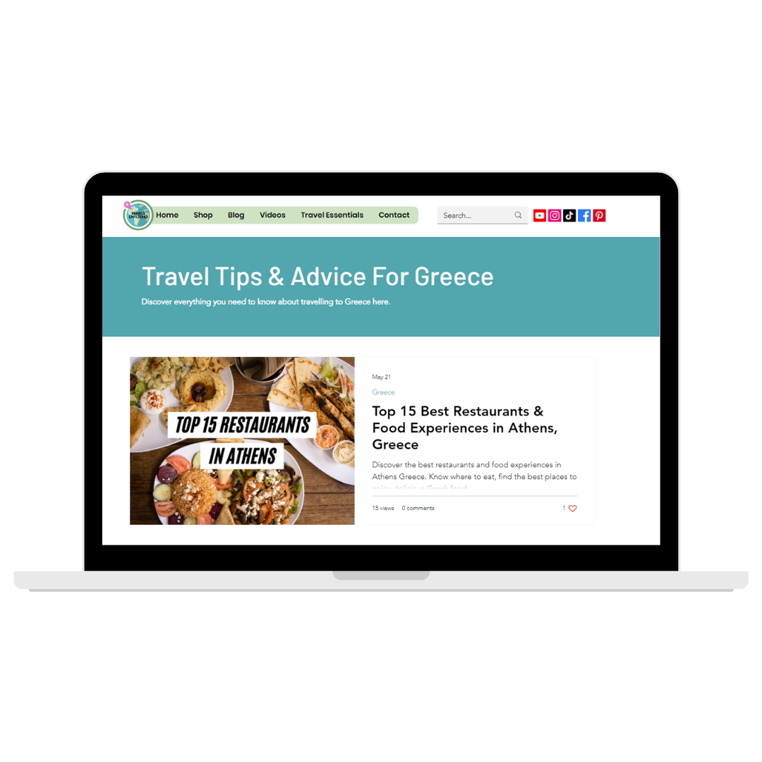
Website Design and Brand Coherence: I designed our website from the ground up, using Wix. Every element, from the layout to the copy, was carefully crafted to reflect our brand's visual identity, incorporating our signature colour palette, fonts, and logo.
Use of Photography and Imagery: Photographs and imagery play a crucial role in our social media presence. Whether captured by me or sourced from royalty-free platforms, these visuals vividly portray the destinations we showcase, adding depth and context to our content.
Visual Identity Evolution and Metrics Improvement: Although our visual identity has largely remained consistent, we've made strategic changes, especially in our YouTube thumbnails and Instagram posts. The introduction of bolder fonts and a neon yellow colour has significantly improved our engagement metrics from a average YouTube click through rate of 8% to 12% , marking a successful evolution in our branding strategy.
Brand Consistency and Visual Ethos: We meticulously maintain consistency in our visual identity across all platforms and materials, using our designated colour palette and fonts. Our focus on high-quality visual content aligns with our ethos as a brand primarily engaged in visually driven platforms like YouTube and Instagram.
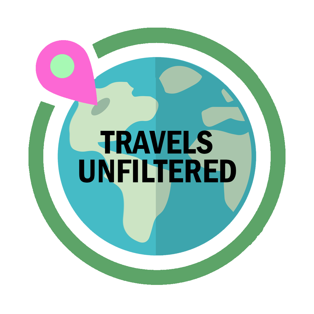
Travels Unfiltered Final (Main) Logo
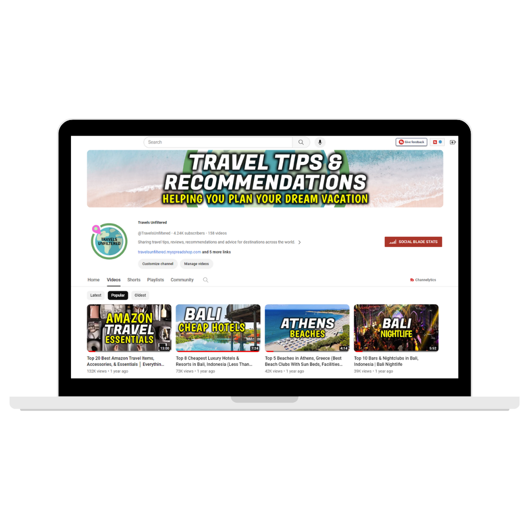
Travels Unfiltered YouTube Channel Branding
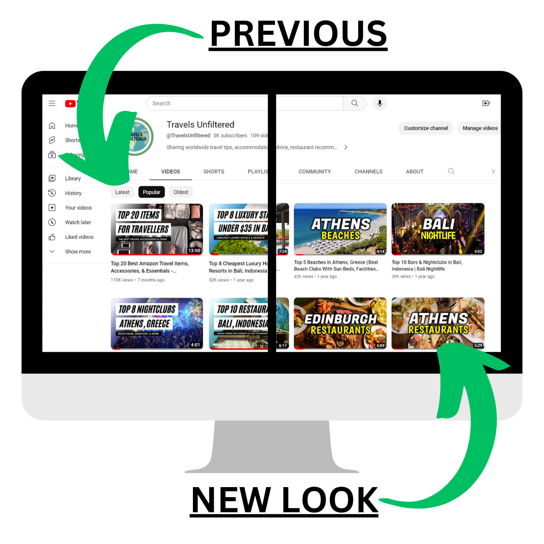
Travels Unfiltered Revamped Thumbnails

Travels Unfiltered Spreadshirt Merchandise Shop Cover Image
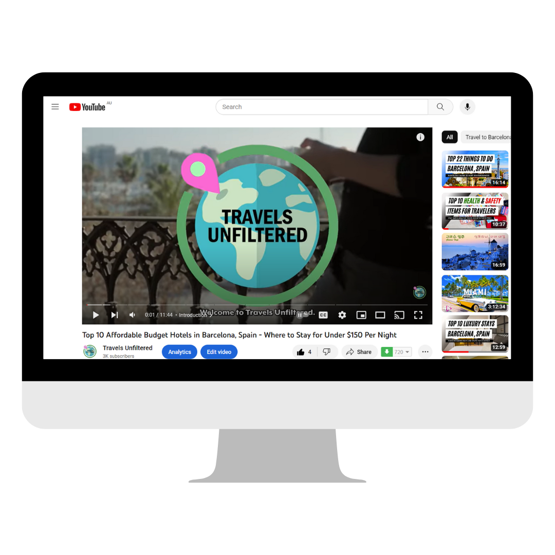
Travels Unfiltered Logo Within Videos
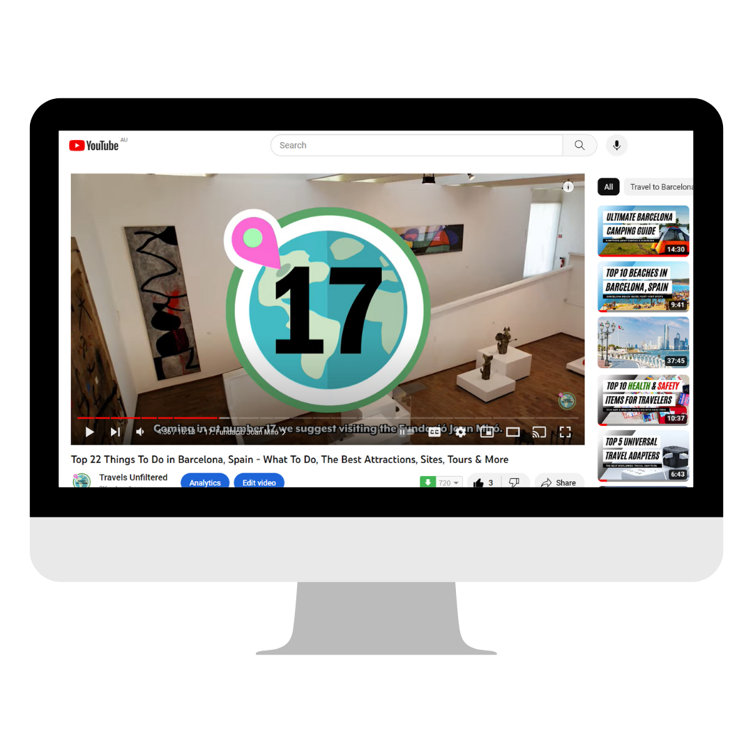
Branding Countdown Icon Displayed in Video
