Project Overview:
As a volunteer marketing manager for the Chios Brotherhood of Melbourne, I had the privilege of designing aprons for the club's kitchen staff. This project was a unique blend of creativity and cultural representation, aiming to strengthen the Greek community's bond in Melbourne.
As a volunteer marketing manager for the Chios Brotherhood of Melbourne, I had the privilege of designing aprons for the club's kitchen staff. This project was a unique blend of creativity and cultural representation, aiming to strengthen the Greek community's bond in Melbourne.
Design Inspiration and Process:
Understanding the significance of Chios Island to the Brotherhood, I drew inspiration from its iconic map and Greece's national colours. My design process involved:
Understanding the significance of Chios Island to the Brotherhood, I drew inspiration from its iconic map and Greece's national colours. My design process involved:
- Initial Conceptualisation: I began with in-depth research into Greek culture, focusing on the map of Chios Island. This symbol of heritage was central to my design.
- Colour Palette Selection: I chose a deep blue and pristine white to represent Greece's national colours, ensuring cultural authenticity and a strong visual impact.
- Typography: A classic serif font was selected to echo the old-world charm and historical roots of the club.
- Mock up and Refinement: After brainstorming various apron styles, I presented mock-ups to the committee. This collaborative phase involved incorporating feedback, refining the design, and ensuring a shared sense of pride in the final product.
Production and Execution:
Collaborating with Spreadshirt for production, I oversaw the printing process, ensuring the aprons reflected the design's integrity and the club's ethos.
Collaborating with Spreadshirt for production, I oversaw the printing process, ensuring the aprons reflected the design's integrity and the club's ethos.
Outcome and Impact:
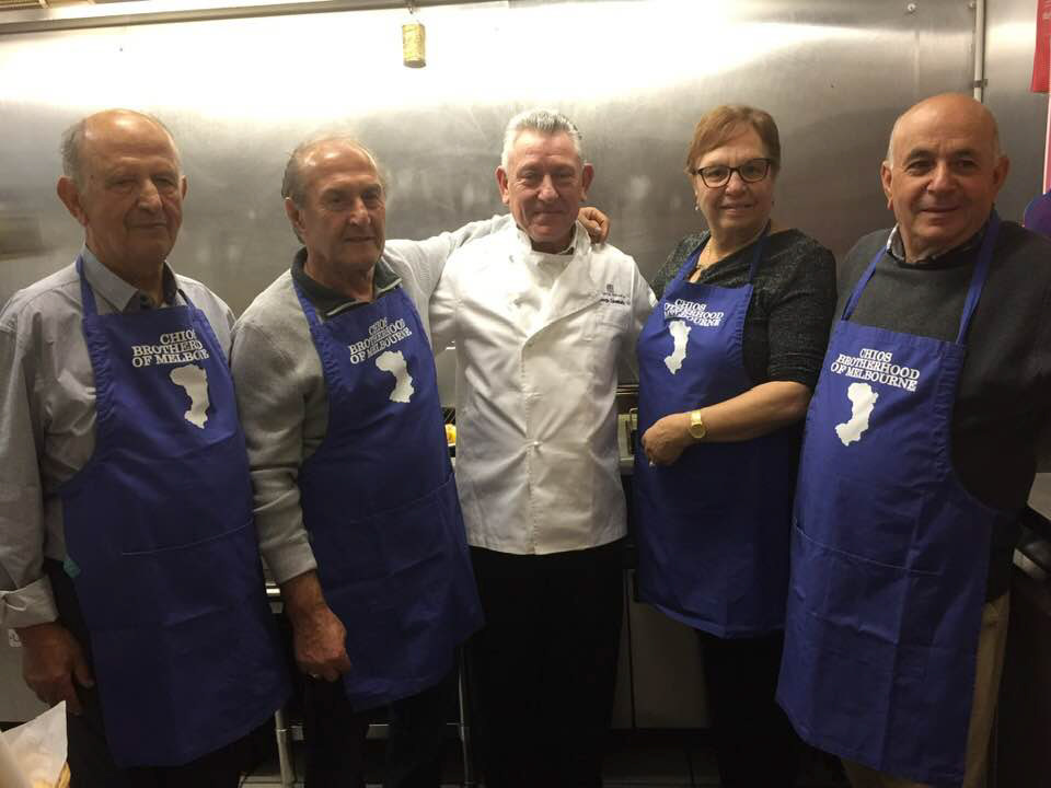
The final apron design was met with enthusiastic appreciation. The kitchen staff, wearing these aprons, became symbols of unity and tradition. This project was not just about creating a functional item but about crafting a piece that represented the spirit of Greek heritage and fostered community connections.
The final apron design was met with enthusiastic appreciation. The kitchen staff, wearing these aprons, became symbols of unity and tradition. This project was not just about creating a functional item but about crafting a piece that represented the spirit of Greek heritage and fostered community connections.
Reflection:
This project highlights the power of design in celebrating cultural legacies and strengthening community bonds. It stands as a testament to my ability to translate cultural significance into tangible, meaningful design work.
This project highlights the power of design in celebrating cultural legacies and strengthening community bonds. It stands as a testament to my ability to translate cultural significance into tangible, meaningful design work.
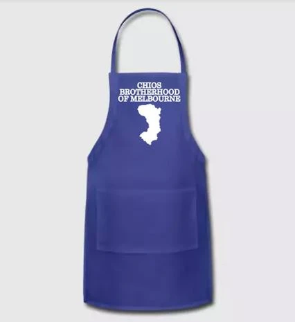
Final Concept of Chios Brotherhood of Melbourne's Traditional Greek-Inspired Apron Design
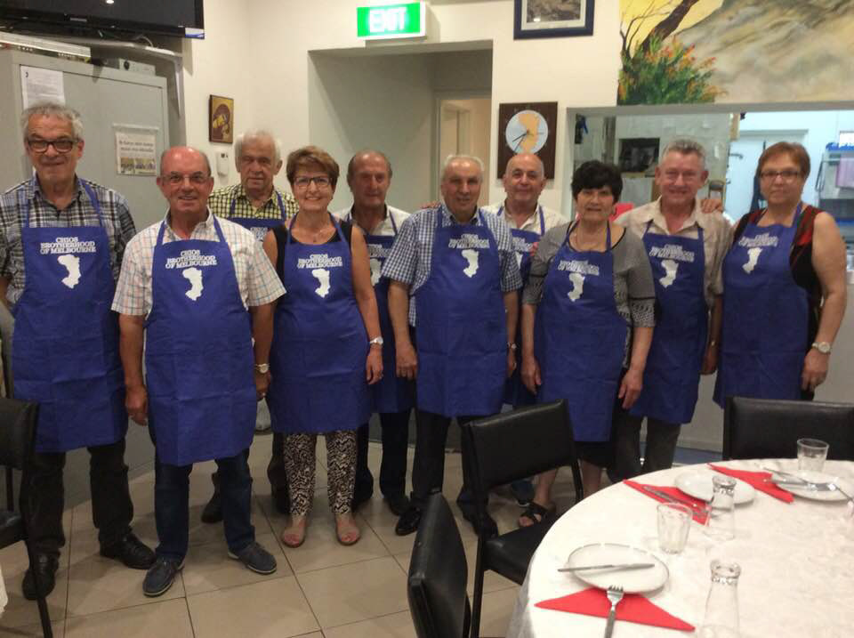
Unified in Tradition: The Chios Brotherhood of Melbourne Kitchen Staff Proudly Sporting Their Heritage-Inspired Aprons
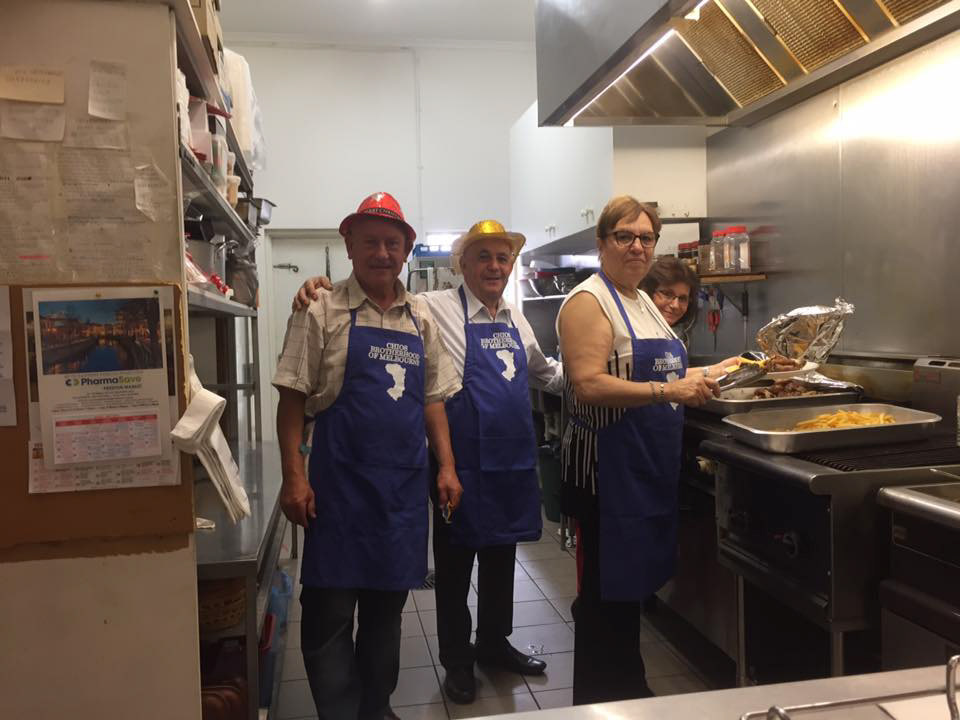
Kitchen Team of the Chios Brotherhood of Melbourne Proudly Donning Their Custom-Designed Aprons During Culinary Preparations
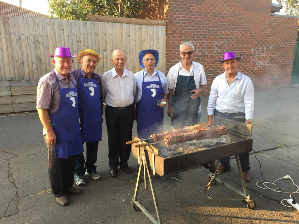
Chios Brotherhood of Melbourne's Kitchen Team in Action: Expertly Preparing Gyros for Carnival in Their Custom-Designed Aprons
